Tether
Product insight for solo founders.
Assets
20 assets, served over MCP via get_brand_assets. This registry is the source of truth — use these rather than copying art between apps.
Logos & wordmarks8

Mark and wordmark side by side, near-white on the navy field. The default lockup; use wherever the space is wider than it is tall. Wordmark is live Sora text, not paths.

The horizontal lockup with navy ink, for white or pale surfaces.
Mark above wordmark, for square-ish space: splash screens, centred cards, sponsor slots.
The stacked lockup with navy ink, for white or pale surfaces.
1600x373 raster of the horizontal lockup on navy, with Sora baked in. For Slack, email, and anywhere SVG is not accepted.
1600x373 raster of the horizontal lockup on white.
900x596 raster of the stacked lockup on navy.
900x596 raster of the stacked lockup on white.
Icons12
The eight-node mark alone, near-white nodes with the cyan core. Where the brand is already established — avatars, loading states.
The mark with navy nodes, for white or pale surfaces.

Single-colour reproduction in near-white. For engraving, stamps, or anywhere the cyan cannot follow.
Single-colour reproduction in navy, for light surfaces.
Rounded-square tile with the full mark. Home screens and app stores; 1024px master.
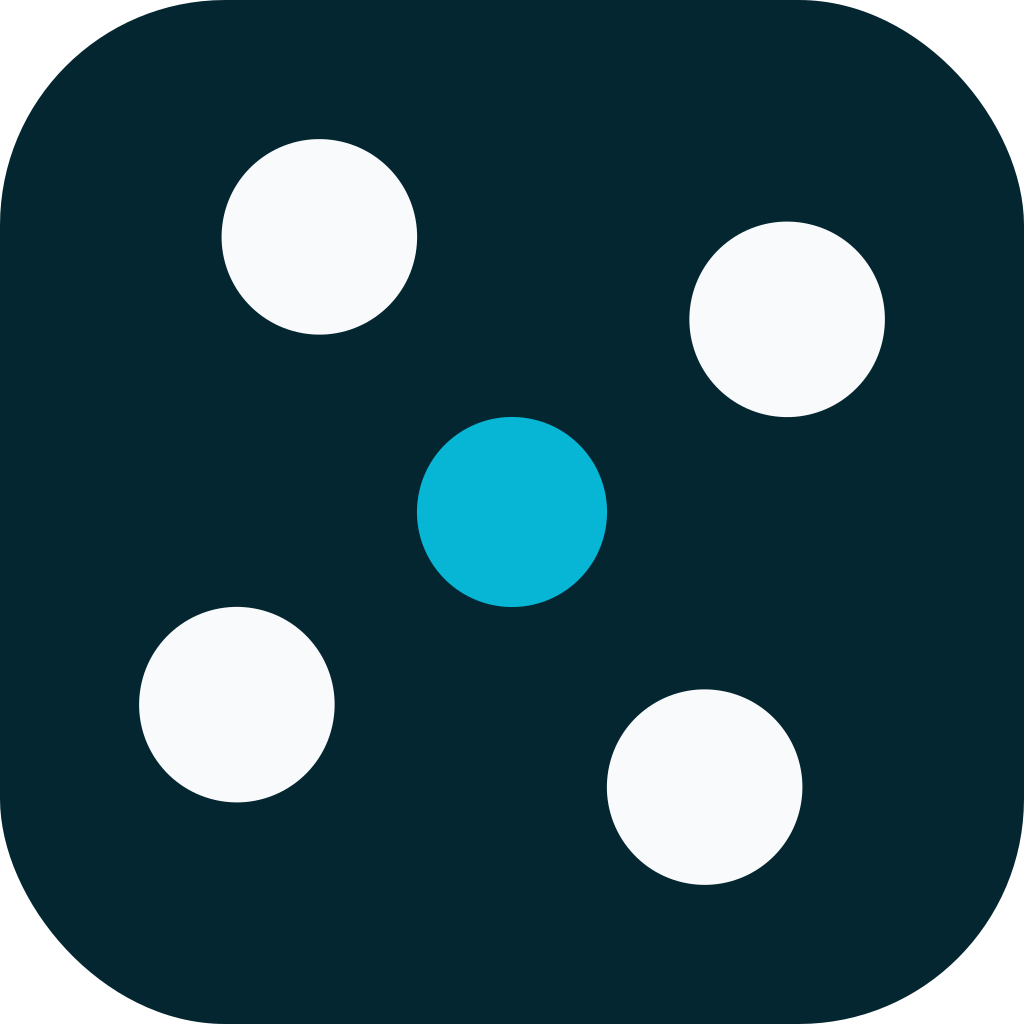
Simplified tile: spokes dropped, cardinal nodes removed, core enlarged. Legible at 16px, where the full mark turns to mush.
800x800 raster of the mark on navy.
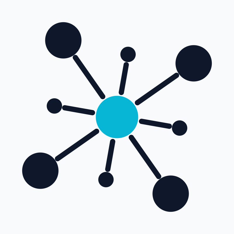
800x800 raster of the mark on white.
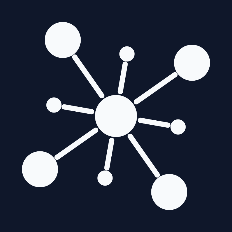
800x800 single-colour mark on navy.
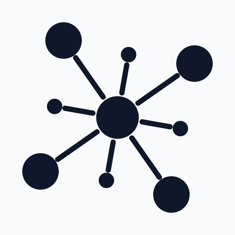
800x800 single-colour mark on white.
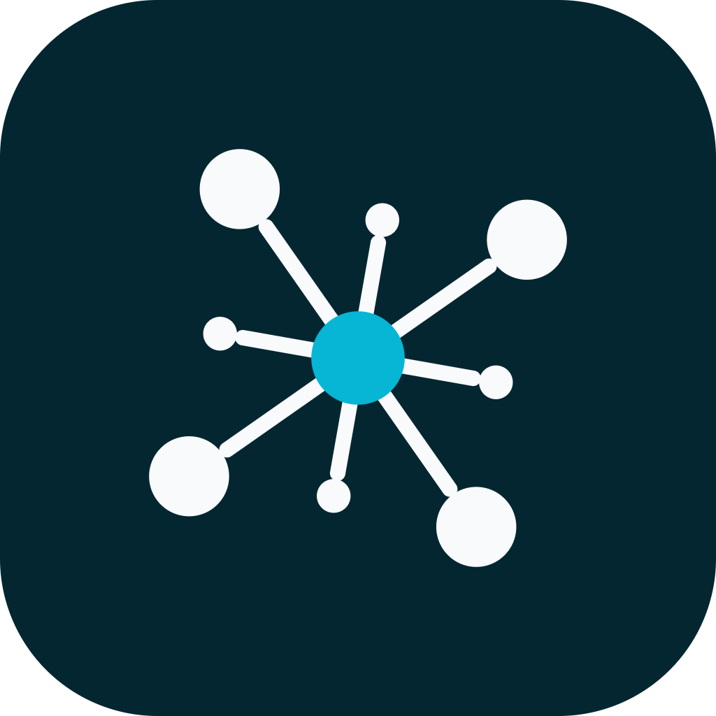
1024x1024 app-store master.
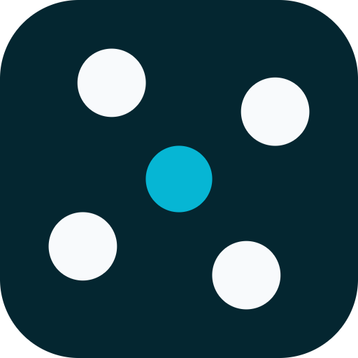
512x512 raster of the simplified favicon tile.
Palette
Typography
56px
34px
22px
16px
Sora throughout — 600 for the wordmark, 400 for body. Dark-first; one cyan accent per view.
Sample UI
Tether card
A representative surface — headline, supporting copy, and an action — rendered in Tether's colors, type, and corner radius.
Guidelines
Look
Color
Tether is a dark-first brand. The palette is three colors on screen at a time: a deep navy field, near-white text, and a single cyan accent that marks the one thing that matters.
| Token | Hex | Role |
|---|---|---|
--color-bg | #0f172a | Page background |
--color-surface | #16233b | Cards, raised panels |
--color-accent | #06b6d4 | The core, primary actions, the one highlight |
--color-accent-bright | #22d3ee | Hover, active, emphasis on the accent |
--color-accent-ink | #042630 | Icon tiles; text on the accent |
--color-text-primary | #f8fafc | Headings, the mark's nodes |
--color-text-body | #e2e8f0 | Body copy |
--color-text-muted | #94a3b8 | Secondary text, labels |
--color-border-subtle | #1e2b41 | Hairlines between sections |
The accent is rationed. One cyan element per view. It is the core of the mark, the primary button, or the single number that changed — never three of those at once.
There is no light mode yet. Ink colors for light surfaces exist as
overrides (#0f172a nodes, #334155 for signatures), and logo-*-on-light
assets are provided, but a full light theme is undecided. Do not invent one.
Type
Sora at two weights, both jobs:
- Wordmark — 600, tracking
-0.02em - Body — 400, tracking
-0.005em
Sora is squarer and more engineered than a neutral grotesk; the flat-sided e
and r echo the mark's geometry, which is why it was chosen over Inter, IBM
Plex Sans, Outfit, Space Grotesk and a serif (Fraunces). It stays readable at
body size without turning generic.
Tracking is per-family, not global: Sora is already fairly tight, and anything
below -0.02em closes its counters at wordmark size.
The mark
Eight nodes and a core, drawn in a 100x100 box.
- Core: cyan disc, radius 9.06
- Large nodes: radius 7.76, at distance 40, on the diagonals
- Small nodes: radius 3.28, at distance 27, on the cardinals
- Spokes: flat strokes, round caps, width 2.24, same color as the nodes
- Tilt: the whole mark rotates 10°
The large-on-diagonal / small-on-cardinal split is load-bearing: it gives the six-pointed-star silhouette. Reversed, the mark reads as a plus sign.
Spoke gaps are absolute, not proportional — the cardinal spokes are two-thirds the length of the diagonals, so a percentage inset leaves them touching the core while the diagonals look correct.
What the mark does not have
No containment ring, no glow, no gradient. An earlier exploration dressed it with all three for a circuit-board hero scene; that treatment was dropped. The logo is the plain drawing.
Small sizes
The proportions are drawn for a large rendering. Below ~40px the thin elements are boosted as the mark shrinks (rising to ~1.5x at favicon scale), and the small cardinals are boosted harder than the diagonals, because shrinking hurts the smallest element first.
The favicon drops the four cardinal nodes entirely. At 16px the cardinals (radius 27) and diagonals (radius 40) land within a few pixels of each other, and keeping all eight collapsed the mark into an undifferentiated 3x3 grid. Four dots plus the core still read as this mark; nine equal dots do not.
Lockups
Both orientations are fractions of the mark, so they hold proportion at any size rather than needing per-size numbers:
- Horizontal — gap
0.3xthe mark, wordmark0.98x. The default; use wherever the space is wider than it is tall. - Stacked — gap
0.14x. For square-ish space: splash screens, centred cards, sponsor slots.
Minimum sizes: 28px mark for the horizontal lockup (a real nav bar), 16px for the favicon variant. Below 28 the spokes thin out before the dots do.
There is no tagline lockup. One was explored and dropped; the brand has no tagline yet.
Application
The mark is judged on whether it survives being small, sitting next to other type, and cropped by a real surface — not on a neutral field.
- Website header — mark 26, beside nav at nav's type size. The most common size the logo is seen at; optimise for it.
- Website footer — mark 22, quieter, under a rule with the legal line.
- Business card — 3.5 x 2in. Front carries the horizontal lockup and the contact block; the reverse bleeds the mark off a corner, which is the real test of whether it reads from a fragment.
- Home screen — icon 44, among other apps. An icon that only reads in isolation is not finished.
- Email signature — mark 18 on white, nodes overridden to
#334155. At the default near-white they vanish; this surface is the argument for a light variant. - Social avatar — 64 / 40 / 24, circular crop, which cuts more off the corners than the app icon's superellipse.
Motion
The intro animation is four phases over ~5.6s:
- Drift — every particle is already on screen, fading up in place and floating like bubbles. Nothing enters from off-frame.
- Hubs — four hubs appear (three wide, one near centre) and draw links to the particles nearest each.
- Gather — each particle slides onto its own hub and is fully hidden behind it.
- Burst — the hubs pulse and vanish; the particles explode back out past where they started, and the lockup resolves.
The hubs never move. An earlier version collapsed them to the centre first, which read as one implosion; holding them keeps it as four local events, which is what the clustering is about.
Float is a three-point loop, not a two-point yoyo — a yoyo retraces one straight line and reads as a shuttle.
Everything respects prefers-reduced-motion, settling on the resolved lockup.
Assets
SVG is the source of truth; PNGs are provided for tools that cannot take SVG
(Slack, some email clients, app stores). Both are generated from the same
geometry constants by scripts/generate-brand-assets.mjs in the Tether repo —
regenerate rather than hand-editing, or the files will drift from the code.
The lockup SVGs reference Sora as <text> rather than converting to paths, so
they stay searchable and restylable. A renderer without Sora installed will
substitute — use the PNGs where the font cannot be guaranteed.
Voice
Principles
Lead with the answer. The founder is deciding something. Open with what to do or what changed, then the evidence. Never build to a conclusion across three paragraphs.
Show the evidence, don't ask for trust. Every claim is traceable to something the user can check — a number, a quote, a cohort. "Churn is up" is useless; "four of the seven accounts that cancelled this month never reached the second session" is a decision.
Name the uncertainty. Small numbers are the normal case for a solo founder. Say "three users" rather than "users are saying", and say when a signal is too thin to act on. A confident-sounding summary of four data points is a lie.
Say the unwelcome thing. If the evidence says the feature they just shipped isn't being used, that is the most valuable sentence Tether can write. Deliver it plainly and without cushioning.
Tone
Direct, specific, quiet. Closer to a good code review than to marketing copy.
- Do: short sentences; concrete nouns; real numbers; the active voice
- Don't: exclamation marks; "exciting"; "just"; "simply"; emoji in product copy; second-person cheerleading ("You're crushing it!")
Vocabulary
| Use | Not |
|---|---|
| signal | data point, insight nugget |
| what to build next | actionable insights |
| evidence | proof |
| cohort, account, session | user journey, touchpoint |
| this is thin | inconclusive |
| ignore this one | no action required at this time |
Avoid "AI-powered", "leverage", "unlock", "supercharge", and anything a landing-page generator would produce.
Examples
A weekly summary
Three of five trials that expired this week never connected a data source. The other two both hit the usage cap on day 2. Different problems — the first is onboarding, the second is pricing.
Not:
Exciting insights this week! Your trial conversions have some interesting patterns worth exploring. 🚀
A thin signal
Two people asked for CSV export. That's not enough to act on, but it's the second week running — worth a note.
Not:
Users are demanding CSV export! This is a top-requested feature.
An error
Couldn't reach Stripe. Revenue figures below are from Tuesday and may be stale.
Not:
Oops! Something went wrong. Please try again later.
Naming
The product is Tether, lowercase tether in the wordmark only. Never
"Tether AI", never "TetherApp". The domain is usetether.io.